Lecture:
- Syllabus Overview
- Introduction to Color
- What is a styletile?
- Using Google Drive to share.
A review of HEX and RGB values (lemasney):
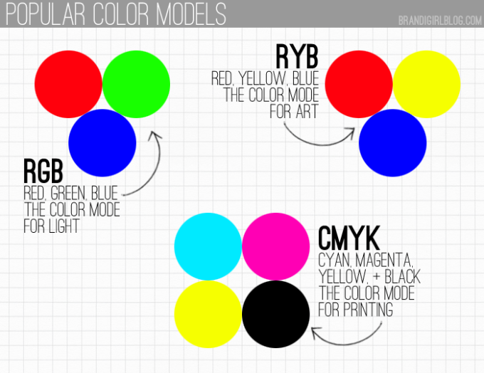
Color can be represented in many ways. You can say “That’s blue” or “that’s rather red.” That’s not enough in web design, or any final design. We want the right red. So if we want a particular red, we can use several classification systems for color to be able to share the right red.
We could express it in RGB values, from 0-255, where higher is more. RGB 255,0,0 is pure red. HEX #FF0000 is pure red. A mixture of numbers results in a mixed color: RGB 255,0,255 (full red plus full blue) is bright purple.
HEX ranges are 16 values per color, zero through F: 0,1,2,3,4,5,6,7,8,9,A,B,C,D,E,F and can be expressed in 2 digit pairs per color (white is #FFFFFF), or one digit per color (white is also # FFF). each character (0-F) is an increasing value of that color, Red, Green, or Blue, expressed singly (#F00) or in pairs (#DF00FF). Purple in HEX would be #FF00FF.
But the most interesting bit is you don’t need to know any of that. You just need to use tools to determine your colors, and record the value as hexadecimal or RGB. Either one works.
About Color Models
One of you shared that you were not sure why the primaries of Red Blue and Yellow are different than RGB and Hex values, and my answer is that Red Blue and Yellow are about color theory (for working out palettes) and RGB is about the digital interpretation and classification of color in light. One is ideological, the other is about recording color. The real difference is that RYB is additive color (pigment based) and RGB is reductive (light based).
“Colour values tend to be originated by designers (such as myself) who would never encounter hex notation anywhere else, and are much more familiar with the decimal notation which is the main way of specifying colour in the apps they use — in fact I have met quite a few who don’t realise how a given hex value breaks down into RGB components and assumed it didn’t directly relate to the colour at all, like a Pantone colour system reference (eg PMS432).” found in colors – Are there any good reasons for using hex over decimal for RGB colour values in CSS? – Stack Overflow at http://goo.gl/0M8nYa
INTRO: Project 1
Personal [Historical Biography Page]
For this project you will pick a historical figure who died before 1923. You will create a webpage in the style of wikipedia for that figure that conveys who that person was through the text and through the design. You will use the text from wikipedia and create your own images in Photoshop or from public domain images. The only requirements are that you can only use one representational image of the person, the rest of the images must be non-representational.
The reason for the death pre-1923 restriction in the assignment is to avoid copyright issues. Photos taken before 1923 are typically in the public domain, as per US copyright law:
“In the United States, determining whether a work has entered the public domain or is still under copyright can be quite complex, primarily because copyright terms have been extended multiple times and in different ways—shifting over the course of the 20th century from a fixed-term based on first publication, with a possible renewal term, to a term extending to fifty, then seventy, years after the death of the author. The claim that “pre-1923 works are in the public domain” is correct only for published works; unpublished works are under federal copyright for at least the life of the author plus 70 years.” found in Public domain – Wikiwand at http://goo.gl/1wbGnd
Demo:
- Course Site in WordPress
- Course site in Google Classroom
- Adobe’s Color Wheel tool: https://color.adobe.com/create/color-wheel/ (Adobe)
- ColorLovers.com http://colorlovers.com (ColorLovers)
- Using Google Drive to Create a Styletile http://drive.google.com (Google)
Resources:
Basic Color Theory: https://www.youtube.com/watch?v=lqzYUIh0Dcg (YouTube)
Color Palettes for Branding: https://www.youtube.com/watch?v=d1a1fun6OfA (YouTube)
Using Google Drive to Create a Styletile:
https://www.youtube.com/watch?v=5mJNFp1-uw8&feature=youtu.be (Sweeney)
StyleTiles explained:
http://styletil.es/ (Styletil.es)
How a Web Site Design Goes to Hell:
http://theoatmeal.com/comics/design_hell (The Oatmeal)
Review:
- Give an example of a complementary color scheme.
- How do you use color tools to establish strong palettes?
- How do you share a publicly accessible link to a Google Doc?
- How does color affect your design?
- How does a StyleTile help you to visualize your look and feel?
- Ideas to know: complementary color, analogous color, style tile, Google Drive, Google Classroom, WordPress, Syllabus, Agenda, Contact info.
Due Next Week (1/27):
Discussion Question:
1: Color:
Pick the website of a musician, writer, athlete or artist that has an compelling design and identify the message or personality that is communicated by the website. Describe the way that the dominant color, color palette, chroma and value contribute to this message. (In the future you will use Google Classroom to submit your answer, but for now, please just leave a comment here.)
Weekly Assignment:
1: StyleTile:
Create 3 styletiles using Google Drive’s Drawing tool. Use 3-5 images, colors, and fonts in each styletile. Look at the example for guidance, You should look for images that have textures or patterns that you will be able to use in the design of your historical figure website. Provide variation in your tiles and play with the style.
Share your StyleTile in PNG format in Google Classroom in the StyleTime assignment listed there. The colors and images should work together to convey the messages you chose to describe your historical figure’s brand.

The website for the very popular musician Adele, has a very simple yet very interesting way of catching the attention of the viewer. The colors most seen in in the website are grays and other monotone colors. Almost to the point where it looks like an older photo. This gives the website a sense of not only seriousness and simplicity, but as well as mystique and a wide range of emotions. The wide range of emotions that can be taken from the color palette of the website include sadness, anger, depression, hope, thoughtfulness, and various other emotions pertaining to Adele’s songs. The monotone colors reflect on not only the colors of her albums but as well as her feelings and emotions being expressed through her songs.
LikeLike
Thanks, Katherine. I like what you had to say, though you forgot your link to the website in question and I’m also missing the link to your styletile. Great start to your discussion though! We will have our entire next session devoted to finishing this, so you are ahead of the game. You can edit your comments, so no need for a second comment, just fix the first one. 🙂
For instance in addition to my discussion about the color of the site, I would add that the site I’m talking about is at http://lemasney.com
https://docs.google.com/drawings/d/1VlpJaetqNaMRATY5pyEZmKOarRDwvLCwB1e45K9v8bA/edit?usp=sharing is the link to my example StyleTile.
LikeLike
Discussion Question: The artist I chose was the R&B artist Ne-Yo. Throughout his career, Ne-Yo has always proved to be a classy gentleman which matches the black, grey, and, white color palette on the website, also mimicking the colors of a suit or tuxedo which he is wearing on the home page. The most dominant color though is red which the website uses to show off Ne-Yo suave side as well. All together the color palette and website represents Ne-Yo very well.
http://www.neyothegentleman.com
Weekly Assignment 1:
https://docs.google.com/a/student.mccc.edu/drawings/d/1VUj7d3o81Z8qgyf2iVFuh3-kWFUE8AOk6moKf4dyfnk/edit?usp=sharing
LikeLike
Thank you for your submission, Denia, but this is not due until next week. Give it some thought, and keep working on your ideas. Upon clicking on your link, I was asked to ask you for permission. Make sure you share the publically accessible link. I’ll explain in class.
LikeLike
This link worked for me, I wonder if it is public. https://docs.google.com/drawings/d/1VUj7d3o81Z8qgyf2iVFuh3-kWFUE8AOk6moKf4dyfnk/edit?ts=56a674b9
LikeLike
Amy Schumer is a new a uprising comedian. She’s made a big debut in 2015 and is probably going to be doing the same in 2016. When you first look at her, she looks like a “typical white girl from NYC”. However, when she’s on stage preforming, your perception of her totally changes. (At least that’s what happened when I fist started watching her) Looking at her, she looks as if she would be this classy, well-grommed, woman but when she starts cracking jokes, you realize that she’s totally 100% raw and vulgar. Which is why I love her. She surprises everyone with the way she talks and the subjects she jokes about. I think her website really portrays her. It’s very clean and easy to navigate. There aren’t many colors, it’s mostly in black, grey and white (besides the pictures). I think they did this because they want to surprise people. Thats the best part after all isn’t it? If you go through her website it’s very modern looking, but click on her video and watch one of her stand ups and you won’t be expecting it. Also, I think I’m more into the modern look of websites myself, which is probably why I like it as well.
Here is the link to her website: http://www.amyschumer.com
And here is the link to my personal satellite: https://docs.google.com/a/student.mccc.edu/drawings/d/1W2pdF3N8XWcgwa-93WYcMsQy6jurR9JNa2_wi2kShB0/edit?usp=sharing
LikeLike
Thanks for your submission, Cailin. Remember that this is not due until next week on Wednesday. We will talk about how this can be useful for you by incorporating more about color into your answer. Your personal “satellite” link does not allow me to get to it. Please make the link public or grant me access, and thanks.
LikeLike
As I look at the examples of the StyleTiles The way they are presented doesn’t make them a Style tile anymore, as I know, a style tile is a visual reference to the design of the website that will be presented to the client and not a final reference of the website. If I understood clearly is that what you ask us to make exactly?
LikeLike
The StyleTile concept is explained in excruciating detail at the link I got the example from: http://styletil.es
LikeLike
Discussion Question: The musician’s website that I chose was Kip Moore’s. Kip Moore is a country artist, who just recently released an album. Having said that, his album is actually the background for his website. It is the main focus of this website as well as his upcoming tours. This website is overall very colorful and appealing to the eye. It also brings a sense of movement, forcing you to look throughout the page. Kip Moore is a fun loving type of person, which is why I feel that this website does a very good job of representing him as an artist.
https://www.kipmoore.net
Assignment 1: https://docs.google.com/a/student.mccc.edu/drawings/d/1Yf7lWhYUVRgBkDz3JRRgaW0RURZqZTMjDNWrEMGWfdU/edit?usp=sharing
LikeLike
Discussion Question: The musician’s website that I chose was Kip Moore’s. Kip Moore is a country artist who has just recently released an album. Having said that, his album is actually the background of his website, which also promotes his upcoming tours. This website is overall very colorful and is very appealing to the eye. The website also brings a sense of movement, forcing you to look throughout the page. Kip Moore is a fun loving person, which is why I think his website does a very good job of representing him as an artist.
https://www.kipmoore.net
Assignment 1: https://docs.google.com/a/student.mccc.edu/drawings/d/1Yf7lWhYUVRgBkDz3JRRgaW0RURZqZTMjDNWrEMGWfdU/edit?usp=sharing
LikeLike
Another way of expressing this: Kip’s site uses a fiery complimentary color scheme, focusing on Blue and Orange, I think it really brings about the fiery live show experience and encourages me to attend the concerts he offers.
LikeLike
Discussion Question: The musician’s website that I chose for this was Kip Moore’s. Kip Moore is a country artist who has just recently released an album. Having said that, his album is actually the background of his website. It is promoted throughout the page as well as his upcoming tours. This website is overall very colorful and is appealing to the eye. It brings a sense of movement, forcing you to look throughout the page. Kip Moore is a fun loving type of person, which is why I feel that this website does a very good job of representing him as an artist.
https://www.kipmoore.net
Assignment 1: https://docs.google.com/a/student.mccc.edu/drawings/d/1Yf7lWhYUVRgBkDz3JRRgaW0RURZqZTMjDNWrEMGWfdU/edit?usp=sharing
LikeLike
Discussion Question: Kevin Hart is an American actor, writer, producer and one of the biggest comedian there is, everybody knows him most for his acting and comedy. Born and raised in Philadelphia, Pennsylvania Hart began his career by winning several amateur comedy competitions at clubs throughout New England. He is the first comedian to impress his crowd with shows that other comedian never did. At first when you see him, Hart gives the impression of a rapper or else than a comedian, but you hear him talk it’s impossible to not smile, Kevin H. is naturally a comedian, that’s the way he is. His website is designed with numeral tiles in which we can see everything he does starting with his movies and series and also his comedy shows. Some tiles flips to also let the viewer see the informations going with that tile or some are a short gif. animation and this is what keeps the viewer’s attention busy moving around the website and also leaves a curiosity. The colors are placed in a odd way and creates a sense of humor which really goes with the celebrity. The other touch in this website that also catches your attention is the picture of Kevin Hart popping out on the right side of the website saying “Let Me Explain!” it gives the sensation that he’s actually talking to you but when you click on it, it gives you information on one of his comedy show and also shows other videos of him on stage. This website is really simple in the presentation yet keeps your eyes moving around and with curiosity.
Here is the link to the website: http://www.kevinhartnation.com/home/
Have fun clicking on each tile!
And here the link to my StyleTile! (Assignment 1): https://drive.google.com/open?id=1kpwp22gcq2Jh3R5d2efP5oX9kVDZLS7nrGcStT06sho
LikeLike
https://docs.google.com/drawings/d/1kpwp22gcq2Jh3R5d2efP5oX9kVDZLS7nrGcStT06sho/edit?usp=sharing
LikeLike
The website I chose was the site of Lesean McCoy, a Runningback in the NFL. My first thought was I would find a website that matched his outspoken and energetic type with a proper layout and colors, but instead found it to be very bland at first sight. The colors used were red, white and blue, due to him being on the Buffalo Bills, so I though the colors represented that more than they did his personality. After exploring I found out it was easy to navigate and full of information and the content of his website really spoke about his personality, in how in touch he is with his fans, and his number of charities and ways he gets involved. While the colors might have been a nod to the Bills (it was green when he was on the Eagles…), the content of his website and what you learn really speaks volumes about who he is.
http://www.leseanmccoy25.com/
Will update comment with styletile
LikeLike
Thank you!
LikeLike
Here is my Styletile.
https://docs.google.com/drawings/d/1kjwB9zjrXCrF0-JuSlldZRTCNh1XEpSOsr93jzoGpX8/edit?usp=sharing
LikeLike
Discussion Question: The Writer’s website that I chose was Nicholas Sparks. His website’s elegance and organization catcher the viewers eyes. Since Nicholas Spark’s books usually have to do with romance, the color palette goes well with his theme. Most of the colors are pastel and have a light value that gives his site a real sense of grace. I would have to say that the dominant color would be the navy blue that is used for his name at the top of the page. This use of the color blue really makes the words pop against the pastel background. http://nicholassparks.com/
LikeLike
The writer’s website that I chose was Nicholas Sparks. His website’s elegance and organization catches the viewer’s eyes. Since his books are usually about romance, the color palette goes well with his theme. Most of the colors are pastel and have a light value that gives his site a real sense of grace. I would have to say that the dominate color would be the navy blue letters that are used for his name at the top of the page. This use of the color blue really makes the words pop against the pastel background.
http://nicholassparks.com/
LikeLike
Thanks, Megan. I still need your StyleTile in the form of a Google Drive Link.
LikeLike
Discussion Question: The person that I chose was musician Sam Smith. Sam Smith is a rising English singer/songwriter. Upon entering his website it is very simple and modern, with use of only black and white. Once you start to navigate through the website and view different tabs you notice not only the use of gray-scale but also different gradients of midnight blue. Sam Smith is best known for writing and singing songs that convey different emotions and moods; such as yearning, intimacy, loneliness and even nostalgia. The gray-scale and muted blues combined with the modern style of his website definitively reflect the style, emotions and moods that are expressed his music.
Website: http://www.samsmithworld.com
LikeLike
Thanks, Juan. I still need your StyleTile in the form of a link to a Google Drive Drawing.
LikeLike
Style Tile:
https://drive.google.com/a/student.mccc.edu/file/d/0Bx3HfdNdKxjxVkNIcWh2bnV0R00/view?usp=sharing
LikeLike
Discussion Question: The band that I chose was Imagine Dragons. Their website uses mostly black, gray and white as its colors, but if you navigate the site you will see other colors such as blue, orange and red. The wide spectrum of colors seems to have been chosen to represent the various styles and influences of their songs. They are described as being rock, pop, indie or alternative, depending on who you listen to.
Website: http://www.imaginedragonsmusic.com
LikeLike
StyleTile: https://docs.google.com/drawings/d/1jH0X52HGM7YWVsXgXefldvqTlLdq7Z5vAcYHq_EratA/edit
LikeLike
Beauty!
LikeLike
The musician’s website that I chose was Keke Palmer. Keke Palmer is an actress and a singer. Being that I personally know and have worked with her, I can say she has an amazing personality. She is full of energy and loves to not only laugh, but loves to make others laugh as well. When working with Keke Palmer, she loved her promotional designs to be simple, but yet appealing. With that being said, I would say her overall website not only reflects what she likes, but also reflects my style of design as well. I love simple flat designs with dark muted colors, but includes one or more vibrant colors that make it pop. The color palette of the website is in grayscale and a bright splash of red that is the navigation bar. I think the designer Lawrence Murray executed the design of her website perfectly because it reflect who she is as a person.
Keke Palmer Website:
http://www.kekepalmer.com
Assignment (Style Tile):
https://drive.google.com/file/d/0B0mOMQjgoW41NlhJZV9xUENlc2c/view?usp=sharing
LikeLike
I chose the band KMFDM’s webpage, it accents their musical style perfectly. KMFDM began as a performance art group, and has always incorporated elements of visual arts in their album releases and live performances. Their music is heavy, with influences ranging from rock to industrial, and the color palate of their album covers is very dramatic. The website’s color palate is simple yet dramatic: crimson red, black, and white make up the entirety of the site’s design. KMFDM’s dramatic appearance is perfectly represented on their website.
Website: http://www.kmfdm.net/
Styletile Link: https://drive.google.com/folderview?id=0B4HSQQ1MZpmEUERmQUIwUVRtUWc&usp=sharing
LikeLike
I chose the band KMFDM’s webpage, it accents their musical stylings perfectly. KMFDM began as a performance art group, and has always incorporated elements of visual arts in their album releases and live performances. Their music is heavy, with influences ranging from rock to industrial, and the color palate of their album covers is very dramatic. The website’s color palate is simple yet dramatic: crimson red, black, and white make up the entirety of the site’s design. KMFDM’s dramatic appearance is perfectly represented on their website.
Website: www.http://kmfdm.net/
Styletile Link: https://drive.google.com/folderview?id=0B4HSQQ1MZpmEUERmQUIwUVRtUWc&usp=sharing
LikeLike
Discussion Question: The website I chose was Taylor Alison Swift, an American singer-songwriter. She is a seven-time GRAMMY winner, and the youngest recipient in history of the music industry’s highest honor, the GRAMMY Award for Album of the Year. She is the only artist in history to have an album hit the 1 million first-week sales figure three times. Taylor’s website looked so good with the retro color and the neon font. The colors most seen in the website are retro late 80’s colors, such as very pale blue, light grayish pink, and light grayish yellow. The retro colors not only represented the color and style of her fifth studio album 1989, but also her feelings and emotions being expressed through her songs. The website is easy to navigate and colorful. It had showed many photos of her, and photos had changed the tone to maked them look like late 80’s photos.
Here is the link to the website: http://taylorswift.com
The link of my StyleTile: https://docs.google.com/a/student.mccc.edu/drawings/d/1TNlkwZz0MW-RX0TpvtH-_GXuvPhdIqf-Ij92CyiKARM/edit?usp=sharing
LikeLike
https://docs.google.com/drawings/d/1TNlkwZz0MW-RX0TpvtH-_GXuvPhdIqf-Ij92CyiKARM/edit?usp=sharing
LikeLike
Discussion Question:
The website I chose was Taylor Alison Swift, an American singer-songwriter. She is a seven-time GRAMMY winner, and the youngest recipient in history of the music industry’s highest honor, the GRAMMY Award for Album of the Year. She is the only artist in history to have an album hit the 1 million first-week sales figure three times. Taylor’s website looked so good with the retro color and the neon font. The colors most seen in the website are retro late 80’s colors, such as very pale blue, light grayish pink, and light grayish yellow. The retro colors not only represented the color and style of her fifth studio album 1989, but also her feelings and emotions being expressed through her songs. The website is easy to navigate and colorful. It had showed many photos of her, and photos had changed the tone to maked them look like late 80’s photos.
LikeLike
The artist I chose is Lana Del Rey. She is an American singer, songwriter, and model. Born and raised in New York. Her music has been noted for its cinematic sound and its references to various aspects of pop culture, particularly that of 1950s and ’60s Americana. Her website has mostly three dominant colors: red, blue, and white. The first impression after looking on her main webpage is an American flag. She is well known from using a retro style, her webpage is a reflection of a her own personality.
Lana Del Rey Website: http://lanadelrey.com
Assignment (Style Tile):
https://drive.google.com/a/student.mccc.edu/file/d/0B-loaxZzA7edeTZOVE1HekhDeE0/view?usp=sharing
LikeLike
The band I did the Discussion question for is Streetlight Manifesto. The website itself is very basic and easy to navigate. The color palette is grey, tan, and white and the dominant color tan allows for the white tiles to pop.The band is very basic and is not about “flash and pizzazz” so the personality of the website speaks volumes about the the bands image. The reason i picked this website was because I enjoyed the layout and how well the colors complemented each other.
The band: http://streetlightmanifesto.com/
Style tile link: https://docs.google.com/a/student.mccc.edu/drawings/d/1_R0H5mGuKB_DhTbfT_toGgbdUVbGq2htoMFzqvj1Dlk/edit?usp=sharing
LikeLike
Discussion question: I chose the official website of Nick Cave who is a musician, poet, novelist and screenwriter. His work frequently features Gothic themes and a mastery of lyrics and prose; finding beauty in the macabre – things such as love and death. I feel this website helps to convey some of that atmosphere in its design. Composed primarily of black, white, and grey with sharp lettering, when moused over – sections highlight to reveal warm colors beneath.
Nick Cave website:
http://nickcave.com/
Style Tile Assignment:
https://drive.google.com/a/student.mccc.edu/file/d/0B7DhJuCkrUUiSl9mM1ZxeEx3YVU/view
LikeLike
Style Tile: https://drive.google.com/open?id=1Yv9UClmjfQstJ_bg4YSblgu0INW2-O6FDeyXpiR3fJo
LikeLike
Here is my style tile:
https://docs.google.com/drawings/d/1lk2B69JrNY9zqcCWAti_aj8hEOdz_RdghN2vKOG7i_M/edit
LikeLike
The artist that I choose is hip-hop artist Andy Mineo. In Mineo’s website you will find that the artist choose a very simple, basic yet tasteful scheme. The designer decided to go with a simple black, white and gray combination. The feel of the website is very reflective of Andy as an artist and person. Born and raised in New York City you’re able to sense and feel a urban theme that is in the website. Urban scenes are not very flashy but more subtle with a very artist presence.
http://www.andymineo.com/
LikeLike
Discussion: For the assignment I used the group Disturbed. The website its self is very simple to navigate. It uses sans serif font and has a monochromatic color theme that goes along with the artwork that works with the image of them being a metal band. It doesn’t feel soft or relaxing, instead hard and active.
Assignment:
https://docs.google.com/drawings/d/1alwzKmMJXXlQn4AgNVpB0Fmz7M8oD8AygFAh7ba-x_c/edit?usp=sharing
~Jamil Alexander
LikeLike
Here is the right Style Tile: https://docs.google.com/a/student.mccc.edu/drawings/d/1lk2B69JrNY9zqcCWAti_aj8hEOdz_RdghN2vKOG7i_M/edit?usp=sharing
LikeLike
The artist website I have chosen were for the Disco Biscuits. The website itself is quite easy to navigate showing different colors for the different pages for concerts, updates and news blog. Since they are a jam band, the different blend of colors are quite simple, yet hold the psychedelic theme of the way the band expresses themselves online.
LikeLike
Discussion: For the assignment I picked the band Halestorm. This rock/ metal band is very well represented through the website, with the dark shades associated with them. The text seems very bold and crisp when placed against the dark blurred image of the band. The website reflects the feel that their music somethings give off, something of sad or anger.
Halestorm Website: http://www.halestormrocks.com/
Style Tile: https://docs.google.com/a/student.mccc.edu/drawings/d/1yFLqm_MFgXBD5c-yeowVESpObDnx-wJ14gJ88lrgi-0/edit?usp=sharing
– Samantha Olearchik
LikeLike
Discussion Question: – Benjamin David “Benny” Goodman was an American jazz and swing musician, clarinetist and bandleader, known as the “King of Swing”. In the mid-1930s, Benny Goodman led one of the most popular musical groups in America. This website is very elegant and well organized. In the website, they use less color which creates attractiveness. Website uses black and white color symbolizing pattern of piano and atmosphere of music. The tan color symbolizes calm and relaxing atmosphere. The website shows movement of music which signifies musician website.
Found in Benny Goodman -http://www.bennygoodman.com/
The link of StyleTile : https://docs.google.com/drawings/d/1iA6j6a5W0I2wB1oL1kAlgu0XLFC1ZGZt5d8Ig3ijLK0/edit
LikeLike
Discussion Question: – Benjamin David “Benny” Goodman was an American jazz and swing musician, clarinetist and bandleader, known as the “King of Swing”. In the mid-1930s, Benny Goodman led one of the most popular musical groups in America. This website is very elegant and well organized. In the website, they use less color which creates attractiveness. Website uses black and white color symbolizing pattern of piano and atmosphere of music. The tan color symbolizes calm and relaxing atmosphere. The website shows movement of music which signifies musician website.
Goodman Website :- http://www.bennygoodman.com/
The link of StyleTile :- https://drive.google.com/a/student.mccc.edu/file/d/0B8pvO3aNPr8Uemd0enlEalV1U1c4SXhQRTZKWTBLS3B2ZVd3/view?ts=56ac0260
LikeLike
The celebrity I chose is Ciara, american singer, dancer, and actor born in Austin, Texas. What I like about her is her simplicity with a touch of sensuality at the same time.
The design of her official website is very simple; simple as Ciara herself. When I look at her pictures on the website, I see a touch of feminity, elegance, sensuality, simplicity, but also purity. By the way, I have always seen Ciara as a simple, feminine and very elegant woman.
We notice a combination of black, white and pink colors; thing that I really like.
In fact, white perfectly blends every color, and it is hard to get tired of it. There is no restriction concerning its since it matched all the chromatic palette. I think white is the color of purity.
Concerning the black, it is important to say that despite its dark side, it offers the face of elegance and simplicity. However, it is recommended to always accompany it with a warm or pale color; used alone, it can quickly refer to sadness. I think it the reason why, pink which is a tertiary color is present on the website. As blue belongs to boys, pink belongs to girls. It is the color of femininity, seduction, delicateness and romanticism. Moreover, we sometimes associate this color to happiness, hence the expression “see the life in pink.”
In sum, by using this colors for her website, I think Ciara express clearly some characteristics of her personality. Pink for her feminity and optimism, black and white for her simplicity.
If you want to take a look at the website, here is the link: http://onlyciara.com/ccmag/
LikeLike